Friday, 16 December 2011

MEDIA ARTS: Kruger Imitation


1. What do you see in this piece of art (describe it)?
I see three small children dressed in very bizarre clothing, too big for them. It looks old fashioned, as well. They are all holding empty cups because they have no food. They look quite similar to the children we see every day, ones who might be the daughter or son of your neighbour. They also look very sad. The words say "Their screams are silent to you".

2. What kind of message did you try to give in this piece of art?
I tried to convey the message that poverty is all around us and we ignore the pleas of those who live in poverty. There are people who are desperately in need of help but we simply turn our heads and choose not to see or hear.

3. Did you like or dislike this piece of art? Why?
I did like this piece of art in the way it conveyed the message. I think that it turned out quite effectively and really punched an impact. I would've liked it if I could have used red, because it really is remarkable how much nicer it looks then! However, the purple does highlight the words "screams" and "silent" quite nicely. I don't like it in the way that it makes you feel guilty about ignoring their "screams". But overall I think that it turned out well.

Tuesday, 13 December 2011

MEDIA ARTS: Barbara Kruger


a.       What do you see in this piece of art (describe it)?
b.      What kind of message is the artist giving in this piece of art?
c.       Do you like or dislike Kruger’s work? Why?

a)      In this piece of art there is a pair of expensive-looking shoes that are highly polished and clean. They are sitting on grass, by the looks of things, and the text says “You can’t drag your money into the grave with you”.
b)      Kruger is trying to convey the message that material things don’t really matter in life and that we shouldn’t place as much value on them as we do. We tend to measure our happiness and our wealth by the quality and quantity of things we own, when true living is when you have friends, family, and love surrounding you.
c)       I like her work because I find it very blatant and impactful. Her work really makes you think about the messages the media is sending you and it forces you to question it and to question your life to really determine what your beliefs are and what the media’s influence on you is.

Monday, 12 December 2011

MEDIA ARTS: Flash Game Critique

1. What I liked most
For my "Gift Delivery" game I liked the actual present and the animations associated with it. I thought it was pretty fun having the bow be the "wings" of my present, and I also really like how the present ripped and the teddy bear fell out, even though I couldn't seem to get the bear to stop falling out afterwards! I think that my present's animations turned out well.
I was also quite happy with the bricks on my houses, because the rectangular brush made it look like there was bricks even though it was just a scattering of rectangles.

2. What could be improved
For the very last scene, I admit I was a bit rushed and so it isn't quite as detailed as the other scenes. I think that there should be more taller objects to make it more difficult to navigate down. I also feel that I should've added a bit more shading to the buildings and surrounding greenery because it didn't receive quite as much attention as the actual gift that you were landing did. I also could've put more Christmas-y decorations around and in the houses (the inner decorations might be visible from the windows).
3. How is this game an improvement upon the original?
I think that my game has much more detailed graphics and is more visually interesting to look at while you are playing. Also, I think that my idea is much more creative and I think that the different aspects (such as the ripping present with the teddy bear falling out) make it more special.

Friday, 25 November 2011

MEDIA ARTS: Moonlander Brainstorming

Ideas for redesigning the Moonlander game:
Spider on web getting through forest
Parachute guy trying to land but can’t land on anything but buildings
Bird trying to land on a nest
Santa dropping flying presents from his sleigh to chimneys
Bats trying to land on food


I actually really like the Santa one, cheesy as it sounds. I'll make the presents have ribbon wings of some sort to move in different directions and the scenery will be a village with chimneys. Also, when the present misses the mark it will rip in half and maybe even have a teddy bear or something fall out of it. ;)


Thursday, 17 November 2011

MEDIA ARTS: Lyrical Photography

Edit number three.
Edit number one.


Edit number two. (Sorry they're not in order at all)

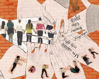
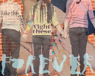
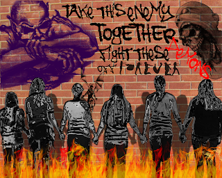
1.     For my pictures, I’m really happy with how different they all turned out. When I was making the first picture, I thought to myself, “How on earth can I make all of these different with the same pictures?” However, I proved myself wrong by using a vast variety of filters and changes to the photos, which made me all the more proud of my work. I think that my favourite aspect of the picture with the graffiti demons on the wall was the ‘chrome’ filter I applied to my friends, because to me it almost appears as if they are coated in armor against these demons. I also really liked the effect of the white hands in my other picture, almost as if they were drawn.
2.     I almost wish that I could make my friends do the “Forever” again, because I wasn’t as happy with how the second ‘e’ turned out and the ‘r’s could be improved upon. I also wish that I might have changed the filter on the bricks behind the picture with the demon sketches, but when I merged the layers to displace them on the brick wall I merged the bricks, too, and couldn’t apply a filter to it.
3.     I think that the second picture that I made, the one with the fire at the bottom and the demons on the wall was the most successful of the three pictures. I like it because it really shows a “united” feeling between my friends (who were the subjects of the photo). Also, as I mentioned above, to me I think that the chrome filter makes it seem like my friends are coated in armor because they are together and now they are invincible and the demons can’t touch them. It also made the best use of brushes and filters I think. I’m proud of how I made the shadows on the wall, because in the actual picture we were inside and the brick picture was taken separately.

Sunday, 6 November 2011

MEDIA ARTS: Photography


I just coloured the hand in this picture, but in the next I did her hair as well because I wasn't sure which I liked better.

So this picture or the other one is one of my black and white + colour photos.

Black and white + colour 2 and also a blurry background photo.
Black and white + colour 3
A couple pictures are similar with a few differences, but I should have 15 ones that are individual and not different edits on the same picture.

Blurred background 1.
One of the non blurry or coloured photos.


So I'm having some problems updating. When I click the photo to upload it in, it immediately gets a red "Server rejected" sign on it. I'm going to try from another computer to see if this solve the problem but if not I guess I'll just upload them at school...

*Later edit* My pictures are now going up but taking a ridiculously long time to upload, so I'm going to post what I've got now and go to bed, then finish it up tomorrow.


Another just regular photo that has been dodged and blurred.

Blurred background 2. This one I had to do different levels of blurring so that Jill wouldn't just be floating off the blurry ground. I've got about three different stages of blurring in this picture.

Black and white + colour 4.

A dodged and burned photo.
Fill frame photo. This is a black white and colour photo as well, even though that makes the total 5, but I thought that giving her eyes the colour made them stand out more and I really liked the effect..

Extreme composition edit with blurred background.

This is a blurred background photo. I used different layers of blurring for this photo as well, but not in the same way as the other one. For this one I made the blurred layer behind the sharp layer and erased the sharpness away from the background. However, for the things that were a bit closer to the front, I made my eraser more transparent so that the objects (such as the leaves on the right) weren't quite as blurry as the background.

Blurred background photo.

Regular dodged and burned photograph.

Different angle dodged and burned.
*Later edit* I'm going to start putting them on again...

Also, I made two different versions of an edit I made above. I just cropped the picture so that it was very long in one of them, and in the other I edited the ground so that it looked more like Jill's foot was in the water versus her just standing with her foot on the ground (even though it really was in the water...)
Half of my pictures are of Jillian and half of Amanda because Jillian wasn't here on Friday.

You might see here that the reflection of the water doesn't really extend to where Jill is sticking her foot in, so in the last picture I tried to artificially edit some more reflection in.

This one's cropped a bit higher up than the last one, but I liked seeing less of the feet.

Here you can see that I gave a shot at making my own puddle/ripple effect.

Friday, 4 November 2011

Cluttered Day

So I was thinking that I was going to edit the rest of my photos tonight and post them, but that didn't work out because as much as I enjoyed helping out with Mr Legace's Herb Miller project, the fact still remains that it took up my entire day and evening. I don't think I'll have a lot of time tomorrow morning or afternoon but possibly tomorrow evening, we'll see how it goes.

--Flightless<3

Thursday, 13 October 2011

MEDIA ARTS: Meet the Sock Sorter


1.) I think that the left arm (the left arm if you're looking at it) was the most successful sculpting in my project because it turned out looking very realistic and metallic. I was really pleased with how the shape of the arm ended up because it did look like something that might be able to pick up items and move them somewhere. I was also happy with how the screen turned out during the paint job because all I did was put a blue "technology background" and lightened it up a bit, then put "Analyzed" and a picture of a sock on it. It looks pretty neat, in my opinion. I think it really looks like a screen.

2.) I wasn't incredibly pleased with the arms on the right side of my machine. They were much harder to do because they were so close to the base and when I grabbed them the base came, too. And when I added in the second arm it was extremely difficult to grab just the one arm and not the other. All of the machine is just one sphere except for the trays on the side and the screen. I thought that the arms on the right didn't look nearly as realistic as the one on the left. I also wasn't quite as pleased with the "sock slot" because it is challenging to make a 'slot' in Sculptris. What I did was make a very deep crease in the base and painted the inside black, but in my opinion it still ended up looking strange because it has 'wrinkles' in the top and bottom of the slot due to the extreme crease I made.

3.) If I did this project again I would certainly make the arms different spheres. This would have made the project incredibly easier because with everything as one big blob I had a lot of difficulty dragging one piece of my machine and not taking another with it (see above--the most challenging bit was the two arms on the right side). I also hope to somehow figure out how to make straight edges in Sculptris so I can achieve a more boxy base for my sock machine... :)


As an extra note, when I was coming up with an idea for my sock machine, I wrote it out explaining it a bit like an advertisement, so I made an advertisement for my sock machine at the top! Here's the original text when I was brainstorming, if you care to read it:

"My idea for an interesting invention is a sock sorting machine!
I always hate sorting through socks, especially when they’re all white with grey heels and toes but you can’t match them up carelessly because on one the lining is different, or it’s a different length, or the material is different, or one has a thicker heel than the other, or maybe even one has non-slip sticky bits on the bottom! It’s frustrating when I have to sort through nearly-identical white socks. My solution to the problem would be that either a) Every single white/grey heeled sock is the exact same (not likely to happen) or … meet the sock sorter!
You put it in front of a pile of socks and it will put a sock into the slot and analyze it with its scanner. It will store a temporary information file about each sock. The sock itself will be piled on thin trays on its side. The machine will continue to scan socks and store them until it finds a match, in which case it will extract the appropriate sock from the pile and match it up. The matched sock is then deposited behind the machine. This process will continue until all of your socks are sorted!"

Monday, 10 October 2011

MEDIA ARTS: My Sculptris Animal!


So I've got two versions of my Sculptris: #1 is just the regular hummingbird clay sculpture at a flower, and number two I applied a motion blur and duplicated my hummingbird's wings a few times to imitate the way a hummingbird's wings blur because they flap them so fast. I don't know which one you'd like to mark, so I put them both up. I figure you can look at the blurred wings one for overall picture and if you want to zoom in on the wings when they are not blurred this is the one.

And since I wasn't here on Friday I wasn't exactly positive if I needed to put up these pictures I took originally...but it can't hurt. If there's anything else I should post tell me.

Reflection Questions:

1. What aspect of your image do you find most successful and why?

I really am quite proud of how the wings turned out. I had no idea how I was going to make wings out of Sculptris because it had given me a lot of trouble trying to sculpt talons out of a ball of clay (and I ended up just not making talons and Photoshopping them in later). I didn't have much luck flattening out things at all, and what is flatter than a feather? But I discovered that if you invert the 'draw' option it works much better than flatten and I got the wings to be the thickness I wanted.  I also was happy with how the 'grab' option pulled the wings and the beak out of my bird's body.
But as for the painting job, I couldn't believe how much more realistic my bird looked after I painted the ruby throat on it! So that was my favourite aspect of my bird for my painting job.

2. What aspect of your image do you find least successful and why?

I wasn't entirely happy with my bird's tail, because it is very thick (but any thinner and it looked ridiculously flat!) and looks like an odd continuation of my bird's body. I couldn't seem to get a proper picture of a hummingbird from the back without its tail feathers spread out, and, as my hummingbird's tail feathers were not spread out it made it difficult to get any sort of realistic texture on it.
The other thing that I fiddled with a lot before settling for the best look rather than the 'perfect' look was my bird's eyelids. I could not make the eyelids go up over the bird's eyes for the life of me! Instead it sort of sits a bit above the eye and sticks out. I had trouble smoothing it down so that it would sit on the eye more because whenever I used the smoothing or grabbing options they would warp my eyeball or flatten it out. Most of the angles my bird is viewed at (before it was painted) it looked angry because of its eyelids.

3. If you could do this project again, what changes would you make to improve it?

I would probably make the wings angled outwards a bit more instead of straight back because from a head-on angle and if viewed from the back it looks rather strange. I would also make my hummingbird's tail feathers spread outwards so that I could put a better texture on them and then they would (hopefully) look more realistic.
I hope to figure out a technique to make my bird look more like it's a part of the background, because if you know where I made the bird it is easy to see that it is not naturally a part of the picture. If I figure out/learn how to do such a thing that would definitely be another change I would make to it.

Thursday, 6 October 2011

MEDIA ARTS: 3D Invention Brainstorm

1.) Give reasons for why you think Da Vinci invented the inventions on the reverse of this sheet.

            I think that, just by looking at many of the drawings, that Da Vinci was very interested in human flight. He wanted to make machines that enabled humans to fly on their own, whether for leisure or for convenience of travel, I don't know. I also think that another reason Da Vinci was drawing designs such as diving suits were so that people could explore more of the mysteries of the world such as what creatures and plant life were at the bottom of the sea. Being able to swim in very deep water would give humans more freedom over where they could travel, as could flying. Items such as parachutes would have the potential of saving human lives if they needed/were going to fall from a great distance. As for the 'war machine', I suppose Da Vinci was thinking that it would aid his country in times of war. All of his inventions were intended to make human life easier and to expand our knowledge of other places in the world that (as of that time period) were currently inaccessible.

2.) Choose one of Da Vinci's inventions, and explain why you think it has had the biggest impact on modern society.

            I believe that Da Vinci's sketches and attempts at producing a diving suit had the biggest impact on modern society because now we have scuba diving suits and can breathe underwater for short periods of time. Scuba diving gear is a part of many professions i.e. diving instructors, marine biologists, and oceanographers. Being able to breathe underwater allowed us to explore the world of life in the seas. It has allowed us to better the theory of evolution and to make connections between underwater life and life on land. We have also uncovered historical artifacts such as shipwrecks and know more about people who lived before us as a result. Diving suits are an important part of our society today and it is phenomenal that Da Vinci dreamed up these ideas centuries before they were realized.


Later edit: As I didn't have many ideas of actual things to 'invent' at the time I posted this, I didn't post the ideas, figuring I'd do it later. Well, I've already started on my invention because I thought up an idea and totally forgot about posting my original brainstorm! So here they are:

Step Two: Make up a list of three (well, I did more...) inventions that would enrich our lives
1.)    Hovercraft
2.)    A ball of light you can carry around
3.)    A machine that can create different weather effects
4.)    An electronic creature that is controllable (if it’s small it can listen to conversations)
5.)    A device that sucks up dirt/dust
6.)  A machine that sorts socks from the laundry


Saturday, 1 October 2011

Interesting Eye Edit

Just for fun, I did an eye edit. It's not spectacular, but I had the idea in my head for ages and decided to try it. :)

Thursday, 29 September 2011

MEDIA ARTS: Displacement Technique

So I experimented with a variety of pictures, including stone walls, railroad tracks, and gravel roads, among other things. My two favourites were when I displaced a picture over a white picket fence and over an assortment of keys lying on a white surface. I liked the fence so much, actually, that I did three different things with it: 1) The way described on the document 2) I took out the spaces between the fence so that the zebras were only on the fence and not on the background, as if the zebras were painted on the fence, and 3) I put the picture on a photo of a lovely house as if it was a fence there.


So it occured to me that on the tutorial you mentioned turning the car blue. I did the purple/pink car first, because I like purple/pink, and it made the car look neat, but here's the blue one if that's what you wanted. :)

MEDIA ARTS: Sunset Lake

Here is the Sunset Lake picture. I thought this was a really interesting technique! :) I will have to look up other pictures to transform...

MEDIA ARTS: The White Strawberry

This was quite honestly a pain in the bum to make. I had a ton of trial and errors. But here is the best one.

Tuesday, 27 September 2011

MEDIA ARTS: The Secret Side of Myself

Here is the final product of the "Alter Ego/Hidden Self" assignment. I'm quite happy with it, I think.
Reflection:
1. This picture shows many different sides of me that a lot of people don't know about. For example, the main focus of the picture is of me casting a Patronus (in my case, a fox) because I love Harry Potter, and that is one of the more important spells that they cast throughout the books and films. A Patronus is unique to each person who casts it as well, as it reflects the individual's personality. Mine being a fox represents that I am clever and independent. The airplane, earth, and Eiffel Tower represent my desire to travel around the world and learn many different languages. I want to go on exchange next year to Spain or Italy so I can learn more about the cultures in Europe and pick up a new language. The book at the top, paper, drawing, and quill are about my love for reading, writing, and drawing, but there are also deeper meanings to things, such as the quill, which has a more hidden significance. The quill symbolizes the past, and how sometimes I wish that we weren't as dependent on our electronic things as we are today. Don't get me wrong, I'm a technology freak, but sometimes things like receiving a letter are simple but mean so much more than receiving a text message. There are a few other pictures depicted on the assignment that show things I want to do or things I like, and I think that the overall image conveys that I am a bit of a dreamer with some practical future plans and some unrealistic fantasies that I keep locked up in my imagination and close to my heart, which is exactly how I am, how my 'hidden self' is.

2. I found that the image of me casting my Patronus was the most successful because I had to do a fair bit of editing to make it turn out the way it did, and I think the work paid off. In the original picture I was just holding a silvery stick, which I replaced with a wand in the final picture. Also, the smoke brushes were very useful in making it seem like I really did have something coming out of my wand, and I think that that part of the picture turned out very successfully.

3. I wish that the Eiffel tower looked more like it was connected to the earth, but because it is blocked by the fox's tail it looks more like it is simply floating in the air. I tried moving it to different locations but it never seemed to turn out right, as it was either too small, too big, too tall, or couldn't be seen. However, when I took it out of the picture entirely it looked blank in the space where it had been. I think perhaps I needed a different picture instead of the Eiffel tower there.

4. As I mentioned above, if I did the project again I would probably find another picture instead of the Eiffel tower to put on the earth, perhaps a different landmark that would be just as recognisable. I'd also add in something to do with Anime, like a picture I drew myself, because that is something I love to do and many of my binder papers have Anime doodled in the margins. I might also take out the second picture of me in the corner and find something else, because I find that the second picture takes a bit away from the first photo of myself. Perhaps that would be where my Anime picture would go....

Monday, 19 September 2011

MEDIA ARTS: More Alter Ego Ideas

So I had a brilliant idea last night for my Alter Ego picture just after I turned my computer off, so I wrote it down and now here it is:

I was going to have it so that either a) I am reading a book on the side and all of my pictures etc. are coming out of it OR b) There is a book on the top of the picture that all of my other pictures are falling out of.

Sunday, 18 September 2011

MEDIA ARTS: More on the Alter Ego Thing

So my plan for my alter ego picture goes as such:

Pictures to include:
-Video games
-Something Harry Potter related
-Lined paper/pen/pencil/quill etc. that relates to writing
-Something travel related, i.e. airplane, world, passport, recognizable landmarks etc.
-An electronic-looking background
-Possibly a Harry Potter anime...(Later edit--turns out I can't do this because cartoons/drawing are copywrited)
-A window showing it raining outside
-Part of my brain is electronic-y?
-Me casting a Patronus/casting a spell
-Books!

More later perhaps...

Thursday, 15 September 2011

MEDIA ARTS: Brainstorming for my Alter Ego Picture

Some little-known facts about me:

1.) I am an absolute Harry Potter freak
2.) I'm really good at video games, even the 'boyish' ones that involve racing cars and shooting aliens.
3.) I loved all sorts of bees until a hornet stung me. Now I don't like hornets but I love the fuzzy bumble bees!
4.) I'm not scared of heights but I don't like the idea of falling from them i.e. I can stand at the top of the CN tower no problem, but if someone wanted me to jump from a 13-meter high bridge into the water, that scares me a bit (but not enough not to try it!)
5.) I love writing, especially fanfiction. I've been planning a series of novels for a long time and have a secret fear of screwing it up when I actually write it. I've got almost three notebooks full of notes for the series.
6.) I stay inside a lot because the things I like to do never really require me to be outside i.e. reading, writing, video games, computers, etc.
7.) I like rain because I can stay indoors without my parents bugging me to go outside.
8.) I hate following people. Even tour guides. I like to know where I'm going and how to get there. I always want to be leading the group and not following it.
9.) Most of the music on my iPod was found through my sister--I never listen to the radio anymore and she just finds it for me, so why bother?
10.) Anyone that knows me knows I'm the go-to for most electronics-related problems (even my parents)


My  biggest goals/dreams for the future:

1.) I'd like to go skydiving someday.
2.) I want to travel around Europe and go sightseeing.
3.) I want to learn to speak at least three different languages fluently. I love learning new languages. This is why I want to travel to Europe, partly!
4.) Go to the Harry Potter Theme park in Orlando and buy tons of souvenirs!
5.) Go scuba diving
6.) Get J.K. Rowling to sign my Harry Potter books
7.) Go to a Harry Potter fans convention


I'm mostly a dork who would happily play in my imagination for days on end. I love video games, electronics, and the Harry Potter books, and I dream of travelling the world and speaking a lot of different languages.

Wednesday, 14 September 2011

MEDIA ARTS: Paintbrushes Assignment

This is definitely the picture I am most proud of to date. It turned out fantastically (in my opinion) and I'm really happy with it. I love how it looks and I love especially that I did not edit a picture or anything because I made it entirely myself :) It makes it special to me.

MEDIA ARTS: Plants in the City Eraser Project


This is, in fact, not Paris. It is Las Vegas, but it has Paris-like buildings in it, yes.  The scene behind it that you can see through some of the erased bits is a river with very lush green trees surrounding it. It was pretty neat making this, and I'm especially proud of how the one car turned out!

Tuesday, 13 September 2011

MEDIA ARTS: Process of Making my Paintbrush Experiment

I'm going to document how I'm doing this before I actually post the entire picture (sort of like a journal of how I made it) so that I don't forget. You don't necessarily have to mark this but it could be useful to know, which is why I marked it with the title as it is.

1.) Put a dark green block at the bottom of my page and coloured the background orange.
2.) Interspersed dark green grass paintbrush patterns with a lighter green grass colour so that it had some grassy texture.
3.) Put blocks (squares) of colour (from orange to yellow in the middle, then branching out to pinks and purples) along the orange bit (my sky).
4.) Put a yellow circle in the centre of my orange-yellow squares and added lighter yellow circles inside of it until the center circle was white.
5.) Used the 'glass' filter on just the sky and blurred everything.
6.) Used the Gaussian blur technique and blended my sky's colours together. Note: I blended the sun and the sky separately (in different layers).
[6.5) See #14]
7.) Used a wire fence brush in black and put it on the picture. Added the barbed wire at the top with another brush.
8.) Put a large brown square next to the fence. Used a square brush at around half opacity and very high 'scatter' setting and proceeded to spread squares in varying shades of brown all over the rectangle so that it looked like it was a brick wall. I would've just used a brick wall pattern but I'm having trouble uploading the patterns so I had to make my own.
9.) Added in 'shadow' rectangles at the bottom of the fence and the building. They were a darker green and I applied a Gaussian blur to both so it would blend with the rest of the grass. Put more grass patterns on the ground.
10.) Put some 'vines' up the sides of the fence.
11.) Added some graffiti to the brick wall with a lot of brushes.
12.) Went into the Filter Gallery>Texture>Texturizer>Brick and changed the scaling to 200% and the relief to 7. The light came from the bottom left. I applied this to only the square rectangle (my 'brick wall') and it made it appear as though my wall had bricks.
13.) Selected the fence with the magic wand tool (I should have done this before I put the fence down, but since I didn't I made do) and copied and pasted it into another layer. Used a cloud paintbrush and put clouds in my sky underneath the fence layer.
14.) Used a white paintbrush of a girl's silhouette and put her by the wall. Made another of the same silhouette in yellow and put it slightly to the left of the white one. Put a black silhouette in between the two coloured silhouettes so that it looked like the sun was reflecting off of her and so that you could see her outline better.
15.) Added some more grass with a paintbrush and gave the girl a shadow like I did the fence and the building.

Graffiti

And this is a picture that I had fun making when we were trying out all the different brushes we downloaded. It's not up for marking, but I wanted to post it because I thought it turned out well.
And the misleading "midnight brushes" or something is also a brush, you know, the ones they add in because that's who created the brushes. I made this picture. Guaranteed. ;)

MEDIA ARTS: Nine of Me Assignment

This is my second version, which I posted on the 14th. The reason I made a new one is because I felt that two of the heads looked too similar and I changed it a little. I didn't intentionally make the faces the same way--they simply turned out similar even though I used two different techniques to achieve the look. I'd prefer it if you marked this one, however, if I'm past due date etc., then don't worry about it.
This is my original picture, which I posted on the 13th.

Here's my faces edit. It's a picture of Nina Dobrev, who stars in the TV series 'Vampire Diaries'. The two main things i want to draw your attention to would be on picture number four, (take a closer look at the lips) and on the last picture, where there is a different edit on the eyes and mouth than her skin and hair.

Monday, 12 September 2011

MEDIA ARTS: Mosaic Picture


Here is my mosaic picture. Looking at everyone else's, I think I did mine a bit differently, but this is the result so tadaa! And I didn't bother mosaic-ing the shirt because it was so dark, and the hair took up most of my time so I figure it made up for it.