 |
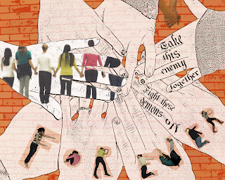
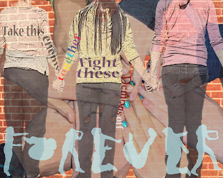
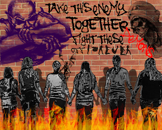
| Edit number three. |
 |
| Edit number one. |
 |
| Edit number two. (Sorry they're not in order at all) |
1. For my pictures, I’m really happy with how different they all turned out. When I was making the first picture, I thought to myself, “How on earth can I make all of these different with the same pictures?” However, I proved myself wrong by using a vast variety of filters and changes to the photos, which made me all the more proud of my work. I think that my favourite aspect of the picture with the graffiti demons on the wall was the ‘chrome’ filter I applied to my friends, because to me it almost appears as if they are coated in armor against these demons. I also really liked the effect of the white hands in my other picture, almost as if they were drawn.
2. I almost wish that I could make my friends do the “Forever” again, because I wasn’t as happy with how the second ‘e’ turned out and the ‘r’s could be improved upon. I also wish that I might have changed the filter on the bricks behind the picture with the demon sketches, but when I merged the layers to displace them on the brick wall I merged the bricks, too, and couldn’t apply a filter to it.
3. I think that the second picture that I made, the one with the fire at the bottom and the demons on the wall was the most successful of the three pictures. I like it because it really shows a “united” feeling between my friends (who were the subjects of the photo). Also, as I mentioned above, to me I think that the chrome filter makes it seem like my friends are coated in armor because they are together and now they are invincible and the demons can’t touch them. It also made the best use of brushes and filters I think. I’m proud of how I made the shadows on the wall, because in the actual picture we were inside and the brick picture was taken separately.
No comments:
Post a Comment