Friday, 16 December 2011

MEDIA ARTS: Kruger Imitation


1. What do you see in this piece of art (describe it)?
I see three small children dressed in very bizarre clothing, too big for them. It looks old fashioned, as well. They are all holding empty cups because they have no food. They look quite similar to the children we see every day, ones who might be the daughter or son of your neighbour. They also look very sad. The words say "Their screams are silent to you".

2. What kind of message did you try to give in this piece of art?
I tried to convey the message that poverty is all around us and we ignore the pleas of those who live in poverty. There are people who are desperately in need of help but we simply turn our heads and choose not to see or hear.

3. Did you like or dislike this piece of art? Why?
I did like this piece of art in the way it conveyed the message. I think that it turned out quite effectively and really punched an impact. I would've liked it if I could have used red, because it really is remarkable how much nicer it looks then! However, the purple does highlight the words "screams" and "silent" quite nicely. I don't like it in the way that it makes you feel guilty about ignoring their "screams". But overall I think that it turned out well.

Tuesday, 13 December 2011

MEDIA ARTS: Barbara Kruger


a.       What do you see in this piece of art (describe it)?
b.      What kind of message is the artist giving in this piece of art?
c.       Do you like or dislike Kruger’s work? Why?

a)      In this piece of art there is a pair of expensive-looking shoes that are highly polished and clean. They are sitting on grass, by the looks of things, and the text says “You can’t drag your money into the grave with you”.
b)      Kruger is trying to convey the message that material things don’t really matter in life and that we shouldn’t place as much value on them as we do. We tend to measure our happiness and our wealth by the quality and quantity of things we own, when true living is when you have friends, family, and love surrounding you.
c)       I like her work because I find it very blatant and impactful. Her work really makes you think about the messages the media is sending you and it forces you to question it and to question your life to really determine what your beliefs are and what the media’s influence on you is.

Monday, 12 December 2011

MEDIA ARTS: Flash Game Critique

1. What I liked most
For my "Gift Delivery" game I liked the actual present and the animations associated with it. I thought it was pretty fun having the bow be the "wings" of my present, and I also really like how the present ripped and the teddy bear fell out, even though I couldn't seem to get the bear to stop falling out afterwards! I think that my present's animations turned out well.
I was also quite happy with the bricks on my houses, because the rectangular brush made it look like there was bricks even though it was just a scattering of rectangles.

2. What could be improved
For the very last scene, I admit I was a bit rushed and so it isn't quite as detailed as the other scenes. I think that there should be more taller objects to make it more difficult to navigate down. I also feel that I should've added a bit more shading to the buildings and surrounding greenery because it didn't receive quite as much attention as the actual gift that you were landing did. I also could've put more Christmas-y decorations around and in the houses (the inner decorations might be visible from the windows).
3. How is this game an improvement upon the original?
I think that my game has much more detailed graphics and is more visually interesting to look at while you are playing. Also, I think that my idea is much more creative and I think that the different aspects (such as the ripping present with the teddy bear falling out) make it more special.

Friday, 25 November 2011

MEDIA ARTS: Moonlander Brainstorming

Ideas for redesigning the Moonlander game:
Spider on web getting through forest
Parachute guy trying to land but can’t land on anything but buildings
Bird trying to land on a nest
Santa dropping flying presents from his sleigh to chimneys
Bats trying to land on food


I actually really like the Santa one, cheesy as it sounds. I'll make the presents have ribbon wings of some sort to move in different directions and the scenery will be a village with chimneys. Also, when the present misses the mark it will rip in half and maybe even have a teddy bear or something fall out of it. ;)


Thursday, 17 November 2011

MEDIA ARTS: Lyrical Photography

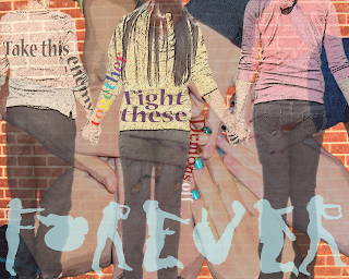
Edit number three.
Edit number one.


Edit number two. (Sorry they're not in order at all)

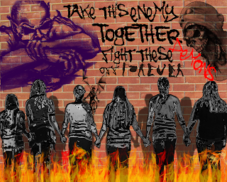
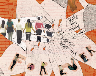
1.     For my pictures, I’m really happy with how different they all turned out. When I was making the first picture, I thought to myself, “How on earth can I make all of these different with the same pictures?” However, I proved myself wrong by using a vast variety of filters and changes to the photos, which made me all the more proud of my work. I think that my favourite aspect of the picture with the graffiti demons on the wall was the ‘chrome’ filter I applied to my friends, because to me it almost appears as if they are coated in armor against these demons. I also really liked the effect of the white hands in my other picture, almost as if they were drawn.
2.     I almost wish that I could make my friends do the “Forever” again, because I wasn’t as happy with how the second ‘e’ turned out and the ‘r’s could be improved upon. I also wish that I might have changed the filter on the bricks behind the picture with the demon sketches, but when I merged the layers to displace them on the brick wall I merged the bricks, too, and couldn’t apply a filter to it.
3.     I think that the second picture that I made, the one with the fire at the bottom and the demons on the wall was the most successful of the three pictures. I like it because it really shows a “united” feeling between my friends (who were the subjects of the photo). Also, as I mentioned above, to me I think that the chrome filter makes it seem like my friends are coated in armor because they are together and now they are invincible and the demons can’t touch them. It also made the best use of brushes and filters I think. I’m proud of how I made the shadows on the wall, because in the actual picture we were inside and the brick picture was taken separately.

Sunday, 6 November 2011

MEDIA ARTS: Photography


I just coloured the hand in this picture, but in the next I did her hair as well because I wasn't sure which I liked better.

So this picture or the other one is one of my black and white + colour photos.

Black and white + colour 2 and also a blurry background photo.
Black and white + colour 3
A couple pictures are similar with a few differences, but I should have 15 ones that are individual and not different edits on the same picture.

Blurred background 1.
One of the non blurry or coloured photos.


So I'm having some problems updating. When I click the photo to upload it in, it immediately gets a red "Server rejected" sign on it. I'm going to try from another computer to see if this solve the problem but if not I guess I'll just upload them at school...

*Later edit* My pictures are now going up but taking a ridiculously long time to upload, so I'm going to post what I've got now and go to bed, then finish it up tomorrow.


Another just regular photo that has been dodged and blurred.

Blurred background 2. This one I had to do different levels of blurring so that Jill wouldn't just be floating off the blurry ground. I've got about three different stages of blurring in this picture.

Black and white + colour 4.

A dodged and burned photo.
Fill frame photo. This is a black white and colour photo as well, even though that makes the total 5, but I thought that giving her eyes the colour made them stand out more and I really liked the effect..

Extreme composition edit with blurred background.

This is a blurred background photo. I used different layers of blurring for this photo as well, but not in the same way as the other one. For this one I made the blurred layer behind the sharp layer and erased the sharpness away from the background. However, for the things that were a bit closer to the front, I made my eraser more transparent so that the objects (such as the leaves on the right) weren't quite as blurry as the background.

Blurred background photo.

Regular dodged and burned photograph.

Different angle dodged and burned.
*Later edit* I'm going to start putting them on again...

Also, I made two different versions of an edit I made above. I just cropped the picture so that it was very long in one of them, and in the other I edited the ground so that it looked more like Jill's foot was in the water versus her just standing with her foot on the ground (even though it really was in the water...)
Half of my pictures are of Jillian and half of Amanda because Jillian wasn't here on Friday.

You might see here that the reflection of the water doesn't really extend to where Jill is sticking her foot in, so in the last picture I tried to artificially edit some more reflection in.

This one's cropped a bit higher up than the last one, but I liked seeing less of the feet.

Here you can see that I gave a shot at making my own puddle/ripple effect.

Friday, 4 November 2011

Cluttered Day

So I was thinking that I was going to edit the rest of my photos tonight and post them, but that didn't work out because as much as I enjoyed helping out with Mr Legace's Herb Miller project, the fact still remains that it took up my entire day and evening. I don't think I'll have a lot of time tomorrow morning or afternoon but possibly tomorrow evening, we'll see how it goes.

--Flightless<3